
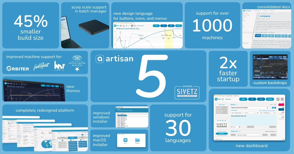
Our biggest update ever
Six months ago, our team grew from two full-time workers to three, and around that time, we laid out the plan for the next phase of artisan’s development. For more than 15 years, Roaster Scope has been the leading choice for coffee roasters of all sizes. As a flexible, powerful, and of course, free and open-source roasting app, we’ve seen hundreds of thousands of downloads and an active user base in the tens of thousands.
Despite the popularity of our core product, we face one particular problem. Developing this software is a full-time job, not to mention the life’s work of a PhD Computer Scientist, and our team needs to be able to earn a living wage. Back in 2016, Paul and Marko came up with a solution to the open-source funding problem: a web platform, a suite of tools for roasters, to which users could optionally subscribe, to get extra functionality out of Roaster Scope, and to support its development.
The platform, which began by focusing on inventory management, now includes a variety of functions useful to professional and amateur roasters alike. You can back up and view data about your beans, blends, and roasts. You can keep track of coffee purchases across warehouses and roasteries. You can build a schedule that syncs with our app and updates as you roast. You can set reminders that go off every so many kilograms, roasts, or days, and they’ll pop up as a system notification on the roasting computer. And you can take all the data about purchasing, roasting, and selling to produce detailed reports.
That platform is still relatively unknown. We have some big-name competitors with far fewer overall users, but far more subscribers, and they have the name recognition. This despite our platform being a fraction of the cost. That’s why, when our team got together in Munich in June, we decided that the very first step we needed to take was to redesign the app and platform, and work on building recognition of what makes artisan special.
On November 5th, after months of quietly working behind the scenes, we announced the biggest update in the history of artisan. Dubbed artisan 5, after the newly launched version of Roaster Scope, this update touches every product and service we offer, from app, to platform, to documentation, to website, to shop, to blog, to our domain name and social media handles.
Below, we’ll go over some of the key changes introduced with artisan 5 under three main areas: Roaster Scope, our platform, and our new website. So, grab yourself a cup of coffee, this is gonna be a long one.
A Redesigned Roasting App
Our flagship roasting app has seen a lot of changes over the years, including the introduction of our signature blue buttons back in v2, the addition of the schedule in v3, and the introduction of various UI modes in v4.
For v5, we once again introduce new elements to streamline the user experience, with the debut of the dashboard.
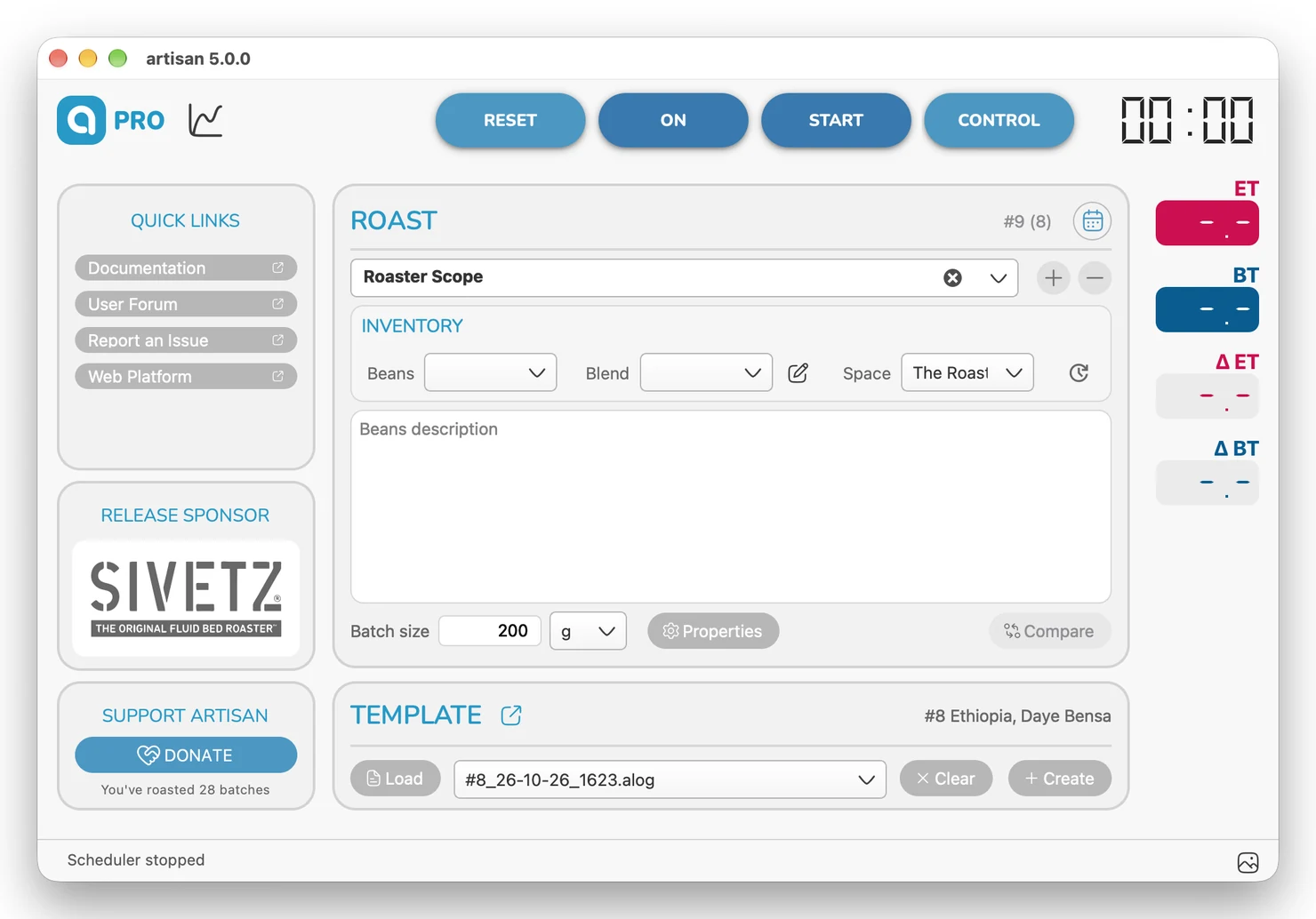
We designed the dashboard with a few goals in mind. Our main objective was to reduce the amount of time users spend in menus. To do this, we brought many of the settings from the Roast Properties menu to the forefront.
As well, we wanted to help users, both old and new, to make use of the great features we’ve introduced for platform subscribers. The schedule is one of our most popular features, but you’d be forgiven for having not even known about it. Now, a recognizable calendar icon tells you it’s just a click away. Additionally, you’ll be able to access your inventory once logged in. Like the Schedule, this functionality was always there, it just lived in a menu and now we’ve given it a more prominent home.
Another goal that motivated the design of the dashboard was to create a dedicated place for some of the information scattered somewhat haphazardly around the app. Take for example the Release Sponsor. Without Release Sponsors, it would be next to impossible to develop Roaster Scope, and we’re incredibly thankful for their support. In previous versions we displayed the Release Sponsor at all times, in the title bar and above the canvas to the right.
We felt that this approach was both somewhat obtrusive and not the best way to thank our sponsors. So in the dashboard, we’ve made a dedicated space for their logo. We think this is better for both the sponsors and the users, who can now simply close the dashboard if they don’t want to see this extra visual information.
This is the perfect time to thank our sponsor for Roaster Scope 5, Sivetz, a long-time supporter of artisan. Sivetz are the makers of the original fluid bed roaster, praised for its efficiency and consistency, and v5 includes improved support for models across the entire Sivetz lineup. If you’re interested in sponsoring a future release or machine integration, we’d love to hear from you.
In the same vein as moving the Release Sponsor mention, we replace our call to action for donations, which used to pop up every so many roasts, with a simple button on the dashboard. Now you’ll never have to see that popup again! And finally, we wanted to use the dashboard to provide quick links to some web addresses we felt users might find helpful to have close at hand. So we’ve included all of our support links as well as a link to the platform.
Alongside the dashboard, Roaster Scope 5 comes with a new icon set and rounded buttons to match our platform’s design language. We’ve also introduced 5 new themes, including 3 from the beloved Catppuccin palette (Frappé, Macchiato, Mocha), alongside Chalkboard, and a minimal light theme that we’re calling Croptastic.
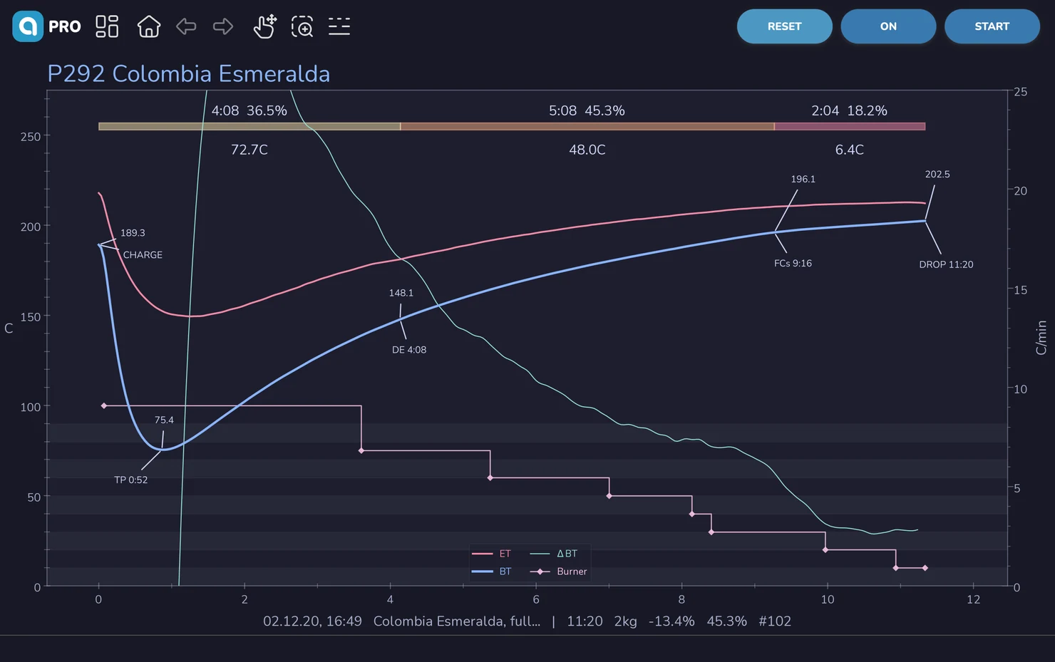
Outside of the design tweaks, v5 also includes a number of improvements behind the scenes, from a smaller installer footprint and faster startup time to improved machine support and updated translations. You can read about everything new in this update in Marko’s v5 release post, or the changelog in our documentation.
A Prettier Platform
When our new teammate Liam joined, he was coming from nearly a decade working for a coffee roastery. First as Head Roaster, then Director of Coffee, and then Director of Product. All of this to say, when it comes to knowing the ins and outs of roastery operations, he knows his stuff. And luckily for us, he has a Diploma of Graphic Design and daydreams about how to make software more enjoyable to use.
The first thing he noted about our platform was that it is very powerful, especially for its relatively low subscription price. For 500 € / year we provide much of the same functionality for which others would charge 3 or 4 times as much; at least.
The problem then must not be the function, he thought, but the form. And so, alongside our platform developer, Paul, and with feedback from Marko, Dave, and a user survey we ran in the summer, he set out to tackle the core usability issues.
The process was time-consuming. The platform, after all, is shaped by the particular data of the user, so while designing mockups in Penpot was a good start, it wasn’t until we began to test real builds across various scenarios that the final form revealed itself in the marble, so to speak.
What we came up with, in our humble opinion, is something that is as nice to look at as it is to use.
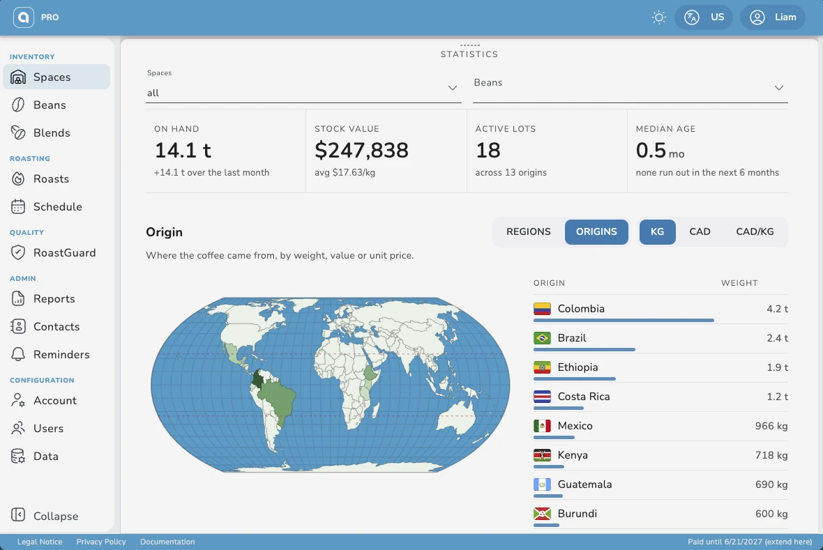
While some of the most notable visual tweaks to the platform may be its new icon set, country flags, or its beautiful interactive charts, the heart of the redesign is the centering of its visual language on user intent.
Each tool (Spaces, Beans, Blends, Roasts, Schedule, Contacts, Reminders, and so on and so forth) has a certain set of actions one would want to take associated with it. These can be broken down as follows:
- key or global actions
- search, filter, and sort
- item-specific actions
- information review
Understanding this is what guided the new unified design language.
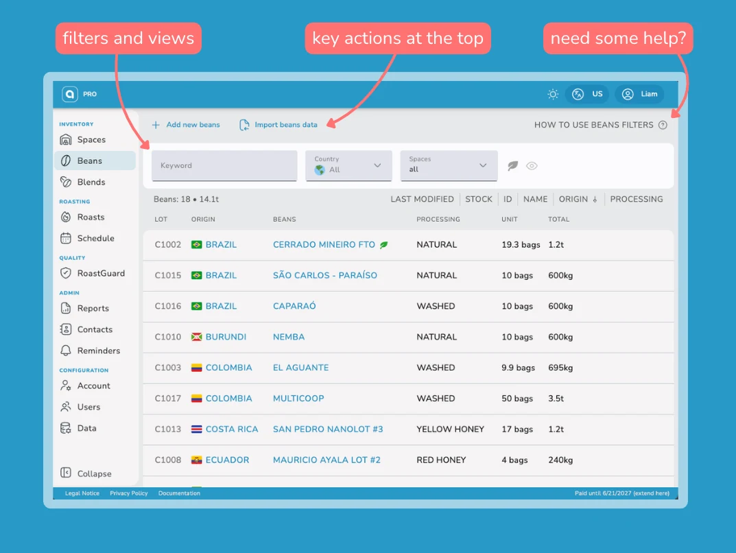
Along the top you’ll find key actions. Often these will be the actions you need to take as a first step when using a particular tool (e.g. adding a new blend). Actions which affect just one element are still grouped with the element they affect (e.g. editing a specific roast).
To the right of those buttons, in the top right corner of any given tool’s page, you’ll find a quick link to the help documentation for that tool. This can be a real time saver when you’re trying to discover some of the nuances of this powerful software and don’t want to have to go digging.
Below this top row is the filter bar. This houses all of the filter and view options for a given page. Some options are always visible, while others appear only when they are needed. Rest assured though, if there is a filter or a view available for a given tool, you will be able to find it here when you need it.
Some tools, like Spaces (formerly known as Stores), Roasts, Schedule, and Reminders, feature an additional details view via a panel that slides up from the bottom.
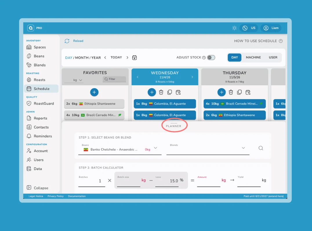
These details view panels already existed in the previous design. However, the visual cue was much more subtle, and some users were completely unaware they even existed. So we made it a lot more obvious through some simple tweaks.
Firstly, we added a label to the details view, right below the handle, so that even when fully collapsed, it’s still noticeable. Secondly, we added a card border and subtle drop shadow to indicate that this panel is sliding in over the top of the other content. This mental framework is important, as a panel like the Planner, for example, is intended to be used in concert with the Schedule, not as an alternative to it.
The content of these panels, like the content of every card, table, and menu, also got redesigned. This is, as you’ll see, a system-wide redesign of the entire platform. All of our decisions (font, icons, colors, animations, wording, images, and element placement) were chosen with clarity and ease of use in mind.
We hope you like this new approach. It’s not just something we’re proud of, but also a foundation that gives us the visual language we need to build our next set of tools. And, if you haven’t tried the platform yet, we’d love it if you would give it a test drive.
New users can, as always, have a 3-month free trial. Existing or returning users can take advantage of our promotion during the month of November and get 5% (up to 25 €) off automatic subscriptions, with code ARTISAN5.
A Wonderful Website
Earlier this year, if you went looking for information about artisan, you were met with a somewhat confusing selection of disparate web addresses. We had one site for Roaster Scope, another for the platform, an old Blogger page (containing some of the very best articles we’ve written), and of course our GitHub repository for the source code of Roaster Scope. To top it off, despite how intertwined the functionality of our app and platform are, the documentation for each was siloed to its own site.
It didn’t have to be this way. So we decided to bring it all together under one domain: artisan.tools.
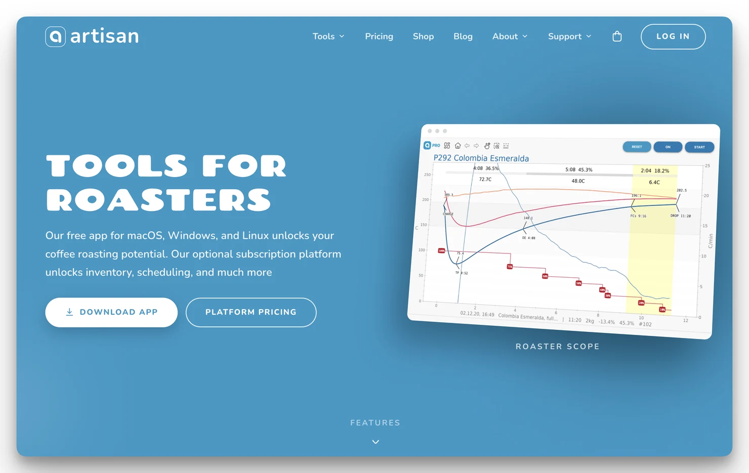
This new website is designed to be intuitive and engaging for everyone, from long-time users to those who’ve just discovered us through a search or social media link. The moment you open the site you’re greeted by calls to action for the three most likely reasons you’ve made your visit:
- To download the app
- To see the pricing
- To log in to the platform
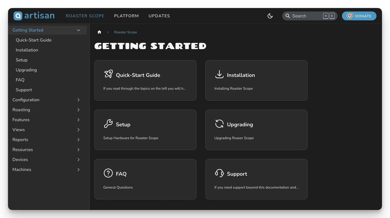
Not the reason you came? No problem. A floating hint informs you that scrolling down, you’ll learn about features. Links in the navigation bar take you to our shop, blog, or support pages. And speaking of support, we have a brand new home for all of our documentation (app, platform, and updates), with powerful search, as well as light and dark themes.
Our shop also gets a big update. It can now, more accurately, automatically calculate shipping and taxes, including VAT in Europe, and we now offer a much simpler signup flow for automatic subscriptions. As before, we still offer prepaid subscription time refills of as little as 3 months and as much as 2 years.
And our blog… well, it’s where you’re reading this. But it’s also home to all of our historic blog posts, going back to the very beginning, combined into one unified experience, with powerful search and tag-based sorting.
A Candid Conclusion
We’re so excited to finally share the fruit of our labour, and we really hope you like the changes we’ve made and the direction we’re taking. If you do, we have a little call to action for you.
We have big ideas for what we want to build next, and even a framework for how we can accomplish it, but we need your support. The only way to continue developing this software is to ensure our team can earn a living wage, and right now, as we prepare to develop our next set of features, we need more of a runway to cover our operating expenses. There are a number of ways you can help support us through this phase.
If you’re a trial user and you’re enjoying the platform, you can purchase prepaid subscription time and we’ll add it onto the end of your current trial, so you won’t lose any of that free time.
If you’re a HOME user, you can consider upgrading to PRO. You’ll have unrestricted access to the platform you know and love for up to 10 users. Alternatively, consider simply adding a small recurring donation of 5 € or more via Ko-fi or GitHub Sponsors.
If you’re a PRO user, you can prepay for up to two years in advance. Or, by switching to automatic renewal, save us some administrative costs. And if you’ve run the numbers and you’re thankful for the savings you get by choosing artisan (especially over one of our volume-based-pricing competitors), you could always consider a monthly recurring donation of 25-50 € on Ko-fi or GitHub Sponsors. You’d still be saving a lot by comparison.
If you’ve read this far, thank you. We hope Roaster Scope and the platform have helped foster your passion for roasting coffee, and, if you run a business, we hope they’ve made your work easier, more enjoyable, and more profitable.
After all, that’s why we do what we do. To make this thing we love, roasting coffee, more accessible for everyone.
